
Wayfinding is an important aspect of architecture, interior design, and site planning. The end user of a space should never feel lost or confused while navigating. This is accomplished most frequently by signs and maps but more recently color has been used as a strong visual "sign" to help people navigate spaces both big and small.
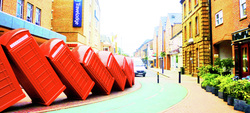
London is known for its gray rainy weather, but since I have been here I do think I have been in a more colorful city. Color is used throughout the city on buildings, in buildings and throughout public areas. A great example of color as wayfinding can be seen in the Southbank Center, located on the Thames just East of the London Eye.
The Southbank Center occupies the old site of the 1951 Festival of Britain. The main building of the festival, the Royal Festival Hall, still stands and is now joined by the Queen Elizabeth Hall and Hayward Gallery along with various restaurants, stores, and other buildings of interest. The three larger buildings are all identified by their own color that appears throughout the Southbank Center. Signs, maps, and even architectural elements of the buildings themselves use their assigned colors to help people locate where they are or which building they are trying to find.
On a smaller scale this also occurs at Kingston University where I attend school. On my campus, different areas of the buildings can be identified by their specific color. Within that system of color-coding, the different levels of the Interior Design course is assigned a color. This helps identify which studio door to enter, which information board to review, and where to find your mail slot.
Color is universal. No matter what language you speak, you can look at a color on a map or a sign then see it on a building or a door and know where you need to go. Color creates a brand that everyone can recognize and understand.


 RSS Feed